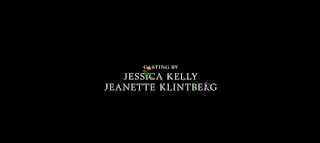
Midsommar (2019) from www.artofthetitle.com It is traditional that our fair queen shall choose… —STEV What titles are displayed during the opening sequences? During the cut segment of this opening sequence of “Midsommar” the title is actually never shown. Director Ari Aster is known for subverting genre conventions, matter of fact, film conventions in general. Knowing this, the title was likely revealed at the end of the film, wrapping up the contents of the film. What images are prioritized in the opening sequence? In this opening sequence, only the names and credits are prioritized. No other images are shown, as just contributors to the film, that being actors, crew, and companies/institutions involved, names are displayed. This is over a plain black screen and instrumental music, maintaining focus on them with little going on outside of those words. What connotations do these images carry? The cursive font and flower images shown carry a calming peaceful mood. This, ...
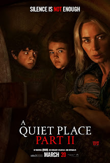
A Quiet Place Part II, 2020, directed by John Krasinki My last movie pick to look into is the 2020 film, A Quiet Place Part II. This film was a huge commercial success and the sequel to one of my all time favorite horror films. It differs from the previous two films because the film features a fantastical creature. Not all horror films are simply about slashers and murderers, but non-human species also make their way into the genre. Researching this movie will help in my creation process because my chosen pitch will include a non-human “monster” so to say. Now, let us look into the opening sequence of the film. • What elements (Conventions) of the genre that you chose to base your final task on does this movie have? One element of the horror-thriller genre that is present here is the use of tracking shots. Characters are followed by the camera as they complete actions. This following not only creates a sense of being followed for the characters, but at the same time puts us ...
With my last few blogs, I had the task of reshooting all my unusable footage. This proved frustrating as I had already fully edited my short sequence. So, having to go back and reshoot, then take apart my project, THEN insert those clips back in, was difficult. As I watched the horror short sequence that I had made for my class project, I realized that it needed a lot of work. The pacing was off, and the scares weren't as effective as I had hoped. I knew that I would have to re-edit the entire sequence if I wanted to improve it. It was frustrating to have to start over, but I was determined to make it better. I began by rearranging the order of the shots to create a more cohesive story. Next, I focused on the sound design, adding in more atmospheric sound effects to heighten the tension. I also experimented with different music tracks to find the perfect score for the sequence. The music I used in the first half of the sequence sounded slightly corny. So I did more research ...
Comments
Post a Comment