Planning Blog: Title Design
After completing my main planning for the opening sequence, the plan for my filming is entirely done. Settings, props, makeup, and schedule has been figured out, which just leaves editing! In the last two previous projects that had been the most difficult aspect of production. So looking forward to this project, there are improvements that need to be made. I have learned things since then that I can apply to this project, so I’m looking forward to working on!
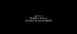
One aspect of editing that I will focus towards in this blog is the title design. The first font I will need to find is for the actors names, casting by, music by, visual effects, costume designer, editor, production designer, director of photography, producer, executive producer, story writer, and director. While these titles come on screen, the tone of the sequence will still be light and neutral. The setting is shot during the morning hours with the sun pouring in, creating a positive seeming film. To match, the font will be light and casual. For this, any default font in my editing program would work, as long as it is casual and doesn’t convey the horror theme that is to come.
After the plot twist at the end, the tone of the film abruptly changes. With this tone switch, the title will come in with a different font that the previous names. The font will dark and dramatic, true to the horror genre. I have found on the website www.dafont.com a font that would work this segment, however I will continue the search as production goes on. It’s slightly too “horror” for me, but it emulates the feeling of the cliff hanger the sequence leaves on.


Comments
Post a Comment